
Are wireframes redundant in the new Agile way of delivering projects or do they just need to change?
Chris and Carla explore the changing way these traditional UX deliverables can help or hinder our projects.
Show notes
Transcript
The Design Untangled Podcast
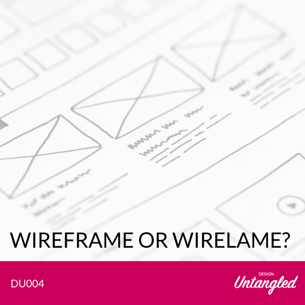
Episode: DU004 – Wireframe or Wire lame?
Hosts: Chris Mears and Carla Lindarte
[00:17] Chris: Hello and welcome to Design Untangled with myself, Chris Mears, and as always, my co-host, Carla Lindarte.
[00:23] Carla: Hello everyone. Hi Chris. How you doing?
[00:27] Chris: Yeah, I’m good. How are you?
[00:29] Carla: I’m good. Good.
[00:30] Chris: It’s strange to record this in the daytime because it’s not our traditional recording day. It’s Black Friday today, so hope you been picking up some bargains.
[00:41] Carla: Yup. I have been buying lots of stuff that I don’t really need.
[00:44] Chris: Same here. I’ve got a motion sensor for my light bulbs, which has pretty exciting stuff. So now when I walk into the kitchen, I don’t have to tell Alexa to turn my lights on.
[00:54] Carla: That’s good. I’m buying a second Mini Google Home, because I’ve got one in my kitchen but I need one in my bedroom.
[01:04] Chris: You’re not Team Alexa then?
[01:05] Carla: No, I’m not Team Alexa. I’m in the Google ecosystem.
[01:10] Chris: Okay, so there was a couple of bits of feedback from the personas episodes to talk about quickly. So the first one was quite an interesting one actually, and it wasn’t a complaint, but it was a comment in the last episode that we seem to agree with each other, and I was a bit baffled by that cause I never really saw this as a kind of, I’ve got one point of view, you’ve got one point of view and then we battle to the death over it. It’s kind of just us talking about our experiences. Sometimes there’ll be the same, sometimes there’ll be different, but I never really saw it as kind of a “me versus you” type thing. I don’t know what you think about that.
[01:52] Carla: Yeah, as I said, I don’t see this podcast as you and I arguing around the different things. We did argue about the music…
[02:04] Chris: We did?
[02:04] Carla: … but not about anything else, and I think we kind of come up with the same conclusions. It just shows that we have similar experience with the stuff that we interact with every day. So that’s all I can say, I guess.
[02:19] Chris: Yeah. So if you’re looking for arguments, you might need to turn elsewhere, unfortunately.
[02:24] Carla: Well, maybe just argue with you more.
[02: 26] Chris: Yeah. We’ll find some more controversial topics to talk about. Maybe we’ll cover Donald Trump or something in a future episode.
[02:33] Carla: Okay. That’s a good idea.
[02:36] Chris: Okay. And you had someone contact you as well that you wanted to mention?
[02:40] Carla: Yeah. I’m not gonna mention names because I’m not allowed to, but just wanted to say thank you for the amazing message I received; personal message on LinkedIn from someone who found all our episodes very, very useful and he was actually looking for more information about podcasts about UX, because apparently he hasn’t found as many, and were there other recommendations I could give him about like listening to people talking about experience design? So maybe that’s something that we can do later on, an episode about resources perhaps like good podcasts to listen to, good websites to go to, good books to read as well. So if people like that idea, maybe we should do that next.
[03:27] Chris: That sounds sensible. So what are we talking about today?
[03:32] Carla: Well, we’re talking about a little bit of a controversial topic, which is what I called the death of the wireframes. Wireframes are dying.
[03:42] Chris: They’re dying, are they? That’s very sad.
[03:44] Carla: Yeah. It’s very sad. I mean I don’t think they’re necessarily dying completely. I think they just transforming from what we knew a wireframe was five, six years ago is very different to what we call wireframes firms right now, don’t you think?
[04:02] Chris: Yeah. I think five or six years ago they were quite highly detailed stuff. Sometimes it was hard to tell if they were the final design or not, and they were very often kind of throw over the fence deliverables to a team of developers so that you could kind of not have to explain any of your thinking. They could just read this document and know what to build. And whilst that’s still the case, I think now companies moving to much more kind of closely integrated teams, which means that the value of the wire frame as a communication tool I think has been superseded a little bit just by having closer communication in general with the people you’re working with on projects.
[04:46] Carla: Yeah, exactly. That’s exactly right. And I think before with a waterfall development or even still like when you have development offshore, there is still the need of annotating wireframes and just having all the kind of functional specifications written down around wireframes. However, as you said, the more and more we work in an agile way, we get all people collaborating and working together, I don’t see the need of a wireframe. I’ve had been in projects in the past where we’ve actually retrospectively creating wireframes after the design has been signed off, just because they are a deliverable, but not necessarily because they useful. Have you experienced that before just doing wireframes at the back of the visual design?
[05:38] Chris: Never done it that way round. They’ve definitely been included as kind of an agency delivery model of old that we’ve spoken about before. You pay for an agency to create a bunch of UX deliverables, one of which may be a wireframe. It may add some value to the project, it may not, but you kind of have to do it anyway. I lot of the time the same thing could be communicated I think just by speaking to who you need to speak to, rather than spending a lot of time on that wireframe, and it depends as well how kind of developed things like pattern libraries are and stuff like that, because if you’ve got a very standardized set of UI patterns, then you can almost build the page just from those in code, some argue. That’s probably a little debate that we can have on this podcast as well, but very often they don’t actually add that much to the UI design over just talking someone through what you want to accomplish on that page.
[06:42] Carla: Yeah, exactly. I mean to the point that you just said, once you have a design system, a pattern library, you just create a new kind of journeys or you create a new pages and you are reusing the same components, especially you’re talking about web design. I mean you could just create a like in Azure for example, you create a widget library and you have all your components there ready and you just drag and drop and construct pages. That’s not necessarily like what we used to know as a wireframe, because it’s a bit more like high fidelity or mid fidelity but still very useful, and you don’t have to go back into Azure to some wireframe again because what’s the point if you already got the design system set up?
[07:24] Chris: Yeah. And the important thing as well I think is that that design system is researched as well, so you’ve kind of understood why certain patterns work in certain situations. They won’t always work so there are arguments to test and update those standardized patterns depending on the scenario. But generally speaking, you’re not adding a lot of value by just reusing a bunch of patterns that you’ve already come up with.
[07:52] Carla: Yeah, exactly. I see a lot of teams getting a bit confused with the terminology because people use sketches, wireframes, small caps, scamps. They all use them kind of like in a similar way, don’t you think? Like people say, Oh, let’s just do some wire frames and then they come up with some sketches, or let’s just do some scamping and they come up with some mock ups. So I wanted to have a definition of what we think. What do you think a sketch is?
[08:25] Chris: Well, should we start, I’m realizing we’re 10 minutes and we haven’t necessarily said to what a wireframe is. I think probably many people will know, but maybe it’s worth outlining what we think a wireframe means in its truest form.
[08:39] Carla: Yeah, that’s true. For me it’s just a framework. It’s a framework of a simple structure of a page. This shows the content hierarchy of the page. It’s normally low fidelity, and it’s just basically to show the architecture of that particular page that you are showing and the message you’re communicating with that design.
[09:09] Chris: Yeah. I don’t have too much to add to that really. It’s just an outline of the page with the various elements you want see on that page arranged in a fashion that indicates how useful they are to the user basically. So if you see them, they’re typically like kind of, I guess, an architect’s drawing a little bit, so lots of rectangles and boxes and stuff like that. Generally kind of black and white as well cause you don’t want to introduce any sort of branding into there, because that’s not really the point of them.
[09:42] Carla: Yeah. I also think that sometimes we make wireframes to look at bit more sketchy. There are tools that you can make them look a bit more sketchy but they are still neat to have that content hierarchy and most importantly as well, I really struggle when people come back to me and they say, you can put together some wireframes and they’re just boxes. If it’s just boxes, it is not really communicating the key content requirements. You basically just need to think about content first. Design is not about the boxes. It is not about the big box image in the middle of the page. It is about the content that you want to put in there, and it doesn’t mean necessarily you write all the copy, but at least have a purpose for that particular module or component and why you have put it in there, and not just the a box with a cross in the middle.
[10:42] Chris: That’s probably one of the…If I’ve got one tip around wireframes, it’s to not use Lorem Ipsen copy in there because all that means is you’re not thinking through what the content should actually be, and as Carla says, it’s not about coming up with a final copy, but you as a UX designer need to have a view on what kind of information you’re trying to get through to the user at that point in the page. So just paying a bunch of blurb I think is not really thinking through the whole problem properly.
[11:10] Carla: Yeah, sure. It really annoys me when it’s just some boxes on the page and not much communication. So yeah. So just going back to what I wanted to do – a sketch is just a very, very rough view of what you want to put on a page. It can be done obviously with … you can draw it, you can use software as well to create some sketches, very, very high level. Wireframes as we said, they are more higher fidelity but still low-fi, and they need to show overall structure for a page and mock ups for me are more like mid-fidelity wireframes, so showing a bit more of the branding and a bit more of the visual treatment without being finalized. That’s kind of my take on these three terms. Do you have anything to add?
[12:09] Chris: No. I think it’s interesting to think about what points you can put those different kind of levels of fidelity in front of users as well. So do you necessarily need to wait till you’ve got some branding on there to understand if the page in itself works? Probably not. So I think even when you’re at the sketching point that you can start to involve users there even. Get them to help sketch the page, understand what they see as important. So these are all just tools to help you understand what your users want to see. And as you add more fidelity to those, you can start to learn new things.
[12:46] Carla: Yeah, that’s true. One thing I wanted to say as well though is that sometimes the sketches and wireframes when they are very, very low-fi and you are conducting research activities, you just need to make sure that you are not testing usability. You just obviously validating your assumptions. You’re validating the content requirements that you are putting on the page. You are validating the overall structure of your journey. But once you go into usability testing and accessibility testing, you really need to go to the higher level of fidelity as possible. That is my opinion, and also make sure that you have more final copy on the wireframe or on the prototype that you are testing, and ideally is a prototype and not just a bunch of static wireframes, because the more the product is closer to the real and final product, the more insight you’re going to get in terms of usability. I’ve seen people conducting usability tests with very, very static wireframes. Not a lot of interaction, not very well written copy and then what you get at the back of the lab test is a lot of negative feedback as well. People are not understanding this, people are not doing this, and especially when you work with research agencies, it gets harder. Every year you are now conducting the research yourself, so this is just a tape, like an experience, you know the closer you go to the final product, the better for usability.
[14:25] Chris: Yeah. Because stuff like branding and color can influence the usability of what you’re designing. Right? So there’ll be some stuff you can pick up with a black and white wireframe versus some different things that you’ll pick up when it’s kind of fully branded, finalized copy, all that sort of stuff. And it depends as well on your audience as well. So I was having a chat the other day actually about testing with legal professionals and I’ve done that in a couple of different projects now, and what we found was because of the nature of their job, they’re very kind of detail orientated. So if there’s a typo or a full stop, a period for our American friends, out of place, then they’ll spend the entire lab focused on that. So it’s actually really important to get that prototype nailed and validated and make sure it is as close to the final thing as you can get.
[15:22] Carla: Yeah, exactly, especially with content and copy. A lot of people underestimate copy, and they don’t think it’s that important. They say, oh we’ll just get a copyrighter at the end, but for UX it is so key for call to actions, labelling, clear functional copy, especially if you are like doing an app or designing an app or something that is quite functional, you need to make sure that everything is really well written and then usability will help you test whether or not you’re doing a good job, but you need to get closer to that final copy state if you really want to get like valuable insight on your prototypes.
[16:05] Chris: Yeah, I think we can probably do an episode on preparing and writing content as part of UX design because I think it’s a topic that’s not very well covered, to be honest.
[16:14] Carla: Yes. That’s true.
[16:15] Chris: It’s all so focused on the UI, but actually the UI is really just a framework for displaying the content.
[16:21] Carla: Yeah, exactly. Especially if you do in website design, you know, I’ve been doing a lot of website redesigns in the past few years and a lot of the design system as it is, you could always try to reuse a two column component, a hero component, a carousel. I don’t like carousels but businesses like carousels, so things like that. They are already there. They’ve kind of a two box that you could pick and choose from. So it’s less about the design of the elements, especially on web. It is more about the copy and the content that you put in there, and that’s what I keep talking to my teams about – content first design. So you just really need to go deeper into the content requirements and be able to really do a good job with copy. So yeah, that’s a great idea to do an episode about copy and content.
[17:18] Chris: I’m just thinking about how wireframes have changed over the last few years. I think one of the key things that’s made them maybe less useful in certain circumstances is the need to design across devices. So now we’ve got people browsing on mobile, browsing on tablet, and from a wire framing point of view, that’s a lot of overheads to create all those different views of screens. So you’ve got the desktop view and you’ve got the mobile view and you’ve got the tablet and you end up needing to create about 4 million wireframes for one homepage. So I think other kinds of solutions for prototyping and mocking up has superseded them now.
[18:01] Carla: Yeah, definitely. I mean in our responsive design project, the best thing you can do is like what I call design on the browser. So if you have a developer in your team or if you are a developer, you should start putting it in the framework, and that’s way more useful than creating wire frames. You can start like right away, prototyping and testing your designs in the real kind of responsive framework. I mean there are other tools like Assure for example, they have the adaptive views. You could potentially also do that to try to come up with a prototype that shows the different views of your design. But yeah, as you said, if you start producing static wireframes for every single viewpoint and then annotate everything, it’s going to be a terrible, terrible job.
[18:52] Chris: Yeah. And especially when you’re trying to iterate on those as well. So if you want to change one element on the home page, you’ve then got to change it in like four different places on your wireframes and it becomes unmanageable very quickly.
[19:06] Carla: Yeah, yeah, exactly. So basically they are dying in my view because they’re not a deliverable anymore. You don’t go to clients anymore and say, you’re going to get a bunch of wireframes. I think it’s just a tool that you could pick and choose whether you need it in your design process, but what I always see is that people still think in a very waterfall way about design. So they kind of like, okay, I need a sketch and they need a wireframe, and then once I have a wireframe, I can send it to the visual designer and the visual designer can color in. Visual designers will get annoyed about this, but that is a very, very waterfall way of seeing design, whereas what you want is the team of visual designer and UX designer ideally. We call them buddy teams working together, scamping, sketching together, coming up with a solution together, and then quickly, especially if you already got a design system in place, getting into the final product as quickly as possible, and ideally, if you have a developer who can develop, it would be much better. You know, that is the ideal world.
[20:17] Chris: Yeah. So that’s another episode I want to do actually is the whole should UX designers be coders as well? Debate.
[20:24] Carla: Yeah.
[20:25] Chris: So we’re getting quite a few good episode ideas out of this, if nothing else.
[20:29] Carla: Yeah, that’s great. So yeah, in conclusion, I think wireframes are not necessarily dying, but they are really, really transforming and UX designer should really know, especially when they come fresh from a course or something that you don’t really need to have all these elements every time you tackle a project. You don’t really always have to have personas, and these journeys, and then wireframes and then visual design. It is a process, a methodology that you have to adapt depending on your project needs.
[21:01] Chris: Yeah. And you should really think of them as disposable as well. So I think that’s led to the issue of people thinking that the final kind of design or whatever, which is quite amusingly why these pieces of software had to enforce themselves looking like sketches so that that problem doesn’t occur. So Azure has a setting on how sketchy you can make your designs when you export them, which is a bit ridiculous if you ask me. So if your stakeholders aren’t understanding that the wireframes aren’t the actual thing, then maybe you need a different approach for explaining them.
[21:39] Carla: Yeah, that’s another problem of very good looking wireframes. Then when they look too good they get confused as the final product, so it’s harder for you to communicate that that’s just a starting point in the design.
[21:51] Chris: Yeah, and I think when you’re presenting those in a portfolio as well, for example, you’ve got these super high fidelity wireframes. If I was the interviewer, I’d be like what? So you’re a visual designer or a UX designer? What are you? You’ve essentially UXed the entire project without the input from visual designers or front end developers or anyone else, and that makes me a bit suspicious.
[22:16] Carla: Yeah, it makes you show that you’re a unicorn. I don’t think there is such a thing like a unicorn. I mean there are very, very few people who can do both really well. UI and UX design and probably build. But a lot of people need to be working more on a team basis and making sure they have their specialisms applied to the design.
[22:39] Chris: So you’ve got anything else on the wireframes?
[22:42] Carla: No. Other than that I haven’t done wireframes in a very long time, which I kind of miss doing wireframes.
[22:49] Chris: Yeah, they can be quite therapeutic, I guess. It’s a chance to put some headphones on and just crack on with some stuff for a while, but in our new agile world, constant communication is what we’re after. So you might have to unfortunately talk to some of your team to get the best results.
[23:08] Carla: Yeah, exactly. Don’t say unfortunately. It’s actually a nice thing to talk to people.
[23:13] Chris: Well, it depends who’s in your team, doesn’t it?
[23:14] Carla: Yeah. Yeah. It depends the user team, but if you are the UX designer, you should always try and go up in the whiteboard and start sketching stuff and getting everyone together, because I think in my mind, not because I’m biased because I’m an experienced designer, I think we are the ones who could need to bring everyone together. We are normally the ones who do that, especially the design teams. So just go for it.
[23:38] Chris: Don’t design in an island, people.
[23:42] Carla: No, don’t and don’t be scared. I know sometimes the Whiteboard is a bit scary. Oh God, I need to stand up and say something. Just go for it. I’m sure you’ll be fine. You are just experimenting anyway. So just try there and get everyone together and be open for collaboration and make others participate in the process as well.
[24:04] Chris: Yeah. And the beauty of the whiteboard is you can just wipe shit off as well. So if you’re drawing just pictures rather than wire frames, just wipe it off. Why not?
[24:14] Carla: Yeah, why not?
[24:15] Chris: Okay. So let’s do our various shout outs then. So you can follow us on @designuntangled on Twitter. You can send Carla only personal messages on LinkedIn by the sounds of it. We have got an email address as well, actually. So that’s designuntangled@uxrktd.co.uk. if you prefer to do that, and subscribe as well if you don’t want to miss any of our new episodes, and leave us a review on Apple Podcasts so that we can get discovered or learn what you want to hear more about, less about and so on.
[24:56] Carla: Yeah, feedback is always, always welcome. And we tried to address it as much as we can in our episodes and we hope you find this useful.
[25:03] Chris: Cool. I’m off to do some more Black Friday shopping.
[25:06] Carla: Yeah, me too. See you later. Bye everyone.